Veggie Perk
Veggie Perk is a recipe blog my friend Elvan started during covid. For her birthday, I wanted to surprise her by giving the original website a makeover.

What’s the deal?
She’s not super techy and made the original site using Blogspot. It got the job done, but wasn’t much to look at. I thought it would be a fun little project to redo it, as I hadn’t really worked on something like this before.
Before diving in, let’s set some ground rules:
- This will be a content-focused, static blog
- It should be a “finished” product — require as little maintenance as possible
- Content has to be easily editable, without much technical knowledge
To make all that happen, I specifically planned on keeping everything as simple as possible — nothing too fancy, just a straightforward and fast blog.
How I built it
I decided to give Astro a shot. It was ranked highest across Interest, Retention and Positivity among Meta Frameworks in the 2024’s State of JavaScript survey. It’s a static site generator that doesn’t automatically load any JavaScript and has built-in Markdown support. This turned out to be the perfect fit since the site barely needs any client-side JS, and Markdown is a great format to base the content on.
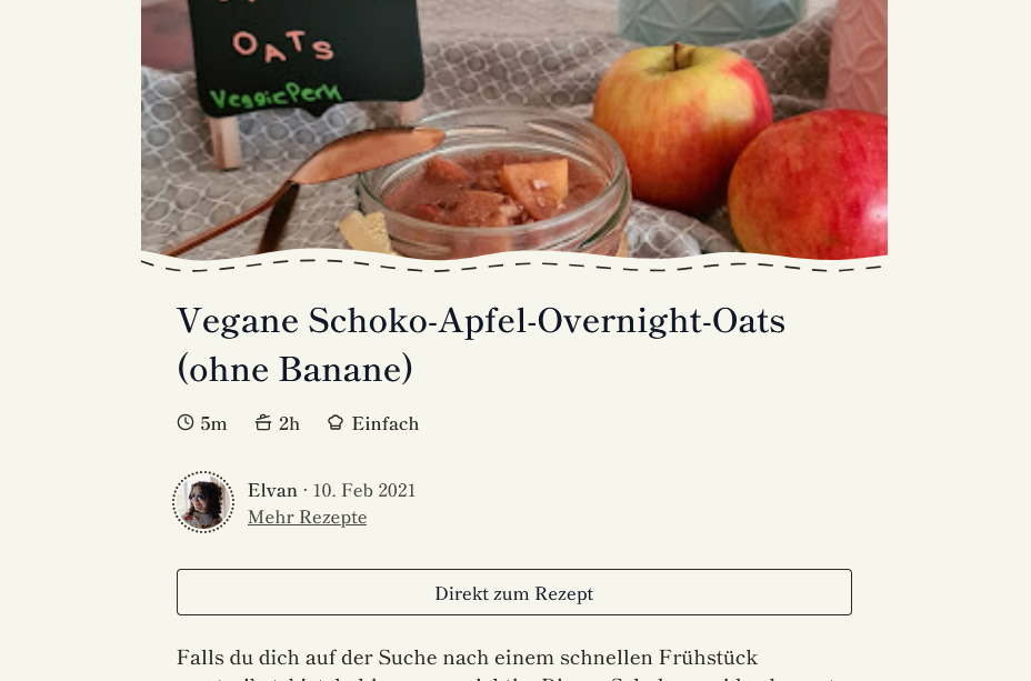
To keep things simple, I only made two pages — a landing page and a recipe page. I also skipped features like pagination, search, comments or resizable ingredient lists, specifically to avoid maintaining those. The only client-side JS is an “I’m feeling lucky” button on the landing page.
The biggest challenge was figuring out how to let Elvan edit the contents. I didn’t want to use a CMS, mainly because I have little experience with those, but also because that just introduces one more variable that could potentially break and require maintenance. I ended up using the note-taking app Obsidian with a git plugin, so she can use it to edit the markdown files and push them to the repo right from Obsidian. The website is hosted on Cloudflare Pages, with a CI pipeline that automatically builds and publishes changes on every commit.

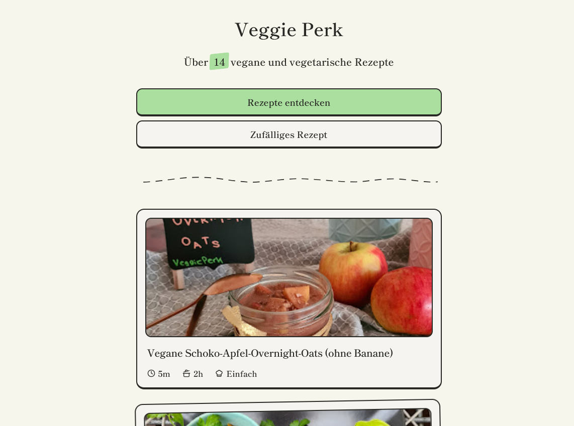
For the design, I was going for a “glued together paper cutouts” look, which I thought would suit Elvan and her recipes well. Inspired by the Claude website, I also wanted to use a serif font on beige background. After fiddling around in Figma, I ended on a clear and simple design that uses squiggly dashed lines and rotated elements throughout, to give it that paper look I was going for. Overall, I’m happy with how it turned out — it’s a clean unique design that fits the content, without being a distraction.
This was the first time in a while that I really set clear goals for a personal project, and it really helped me focus on what’s important. Usually, my personal projects tend to get bigger and bigger as I keep wanting to add cool stuff. But this time, I would actually have a finished product and a clear end. That’s really satisfying, and something I’ll focus on more for my future projects.
Most importantly, Elvan loved the website when I showed it to her! Fingers crossed for some new recipes soon—